Simplifying The Long Form Process
Role
Lead Designer
Project Duration
2 weeks

Read Time: 6 min
Forms, for the most part, have been the primary way to acquire users' information. We interact with forms in applications, signing up for new services, and anytime we purchase something online, we know we will see a checkout form. It's not something we look forward to doing, but it's more like a chore/step standing in the way of what we want to obtain. So for something that has been around for so long and for the most part has been in a question and answer format, how do we make that process of filling out a form a little less daunting for the user, and what elements could we improve upon to get the user from the starting line to the finish line.

You may think why even put in the effort towards improving a system that has been put in place and has proven to work..
But at Swift Shift, this form is what's standing in the way from lead to a new hire. Their number one business driver lies in recruiting and converting new nurses to their platform. Nurses are in high demand and have many options for finding a position due to the supply-driven market dynamics. So if you think about it, this form is what's driving the train, and it's what's igniting their fire.
The Problem
When working in health care, many requirements need to be upheld, such as acquiring the appropriate documents, background checks, and reference checks, to name a few. On top of that, Swift Shift's platform caters to several types of nurses, and their business model works as a type of marketplace that allows nurses to find cases that meet their skill level and work preferences. Nurses have different skill sets, and in order to provide the right cases, all this information needs to be known beforehand. So as you can understand, Their hiring process has been long, leading to a substantial drop-off rate.
They broke up their application process into two parts:
Initial Sign-Up Form - Where they asked for basic information such as personal information, license information, and work preferences.
Complete Your Profile Form - Where once they signed up, they could access the platform where they would need to upload the necessary documents to be able to work for a client.


They found that breaking up the form into two parts led to nurses not completing the second part of the application process, leading to leads getting lost in the funnel.
The issues that I found upon completing their initial sign-up form were surrounding how they broke up questions.
Some questions were grouped, and other questions were left to a single component on a page.
What could have been broken up into a two-page process has now become a six-step process with no indication of where you were holding and how much you had to go

The Challenge
How could we build a form that presents information in a consumable way, limits the number of actions a user needs to take, and at the same time is successful in obtaining all the information that is required from the nurse while staying compliant with health care requirements.
Knowing that I didn't have the resources or the timeline to do an in-depth dive into the problem space and fully grasp their user's motivations and pain points, I pulled upon other facets to guide my design decisions.
The Process
I followed a lean UX process starting with a problem statement that led to assumptions that I could make based on the target user and my experience based on my prior UX and psychology knowledge towards formatting forms.
Assumptions
-
Nurses are familiar with a lengthy application process, and they would rather get it done in one shot.
-
Nurses want to work for clients that meet their specified preferences and schedule.
-
Forms become easily understood if you group similar questions.
-
Forms are more digestible if you break them up into steps.
-
Adding visual form elements will make the form a little less daunting for the user.

Research
Because I didn't have the resources for an in-depth research phase, I had to adapt and use available resources. I relied heavily on Jon Yablonski's book, where he defines the laws of UX in the context of psychology. And I turned to the head of nurse recruitment operations to understand what preferences nurses look for when considering working for a client.
Knowing that I didn't have the resources or the timeline to do an in-depth dive into the problem space and fully grasp their user's motivations and pain points, I pulled upon other facets to guide my design decisions.
Key Takeaways:
Miller's Law
Humans' short-term memory is limited, and applying chunking helps us retain information more effectively. By structuring content into visually distinct groups, we can effectively make content easier to comprehend.
Hick’s Law
We have a limited amount of space in our working memory. When the amount of information coming in exceeds the space we have available, we struggle mentally, leading to tasks becoming more difficult, details being missed, and we start to feel overwhelmed.
User findings regarding work preferences:
Age, Travel, Distance, Hours Available, Preferred Shifts.

Working out the structure of the form
The brief I was given outlined a long list of questions that needed to be incorporated and some multi-step actions required to be taken by the nurse.
My goal when structuring this form was for it to be easily understood and easily digestible.
Pulling from Hick's and Miller's law, I took the 17 question requirements and grouped them by similarity, and then divided those groups into a four-step form process. Breaking up the form by topic allowed me to limit the number of questions per page and reduced the amount of information the user would take in.
Combating multi-action form inputs
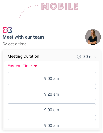
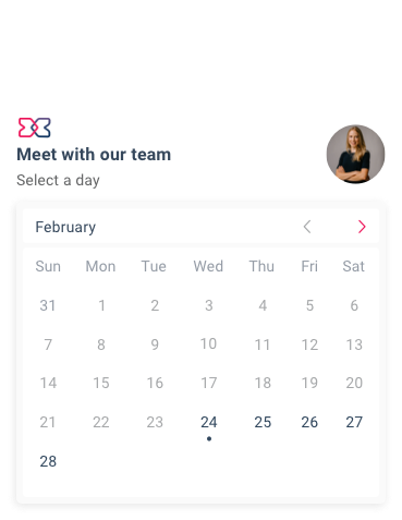
Scheduling an Interview
Swift Shift requires applicants, as part of their application process, to schedule an interview with one of their team members or upload a short video introduction.
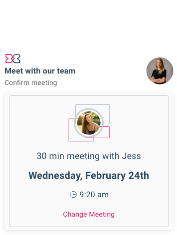
The challenge surrounded scheduling an interview because it requires multiple actions to be taken by the user. To keep to the form's structure and limit the number of steps taken, I knew I would have to design the experience within that page.
I limited the experience to a single card where the user would choose a date and time and then view the details of their meeting where they would click continue to confirm or click change meeting to make changes.


Adding References
Swift Shift must obtain applicant reference information to comply with health care regulations. Reference information requires multiple inputs in addition to the rest of the form.
The challenge was to incorporate the additional input fields in a way that would still uphold the structure of the overall form and work towards not overwhelming the user.
I structured this section as a pop-up form pulling influence from Linkedin's "Ad Job Experience" section on a user's profile. A nurse would click the plus icon where they would be able to fill out their reference information, and once they click save, the information the nurse had put in would be presented in a side-by-side card on the main form, which they can edit if they choose to.


Visual Design
Forms, for the most part, are formatted as a question followed by an input field. When designing this form, I started to think about different ways to improve upon that basic format. How could I elevate the radio button? How might I remove dropdowns for questions that have multiple options? How can I simplify and break up a section that has ten questions an applicant needs to answer? These questions guided my design decisions and allowed me to think about design in the context of usability.
The first thing I incorporated into the form was a multi-step form progress indicator. Showing the user what to expect and where they are holding in the application process helps users stay engaged and has been proven to reduce user's anxiety when it comes to the daunting task of filling out a long-form.

My incorporation of visual form components allowed me to break up the form into easily digestible chunks.
I utilized subtle color contrasts to make the form a bit more visually pleasing and designed creative input fields to reduce scrolling and help keep users engaged.


I thoughtfully used white space and a contrasting background color to keep the user's eyes centered on the task, limiting distractions.


The Outcome
I really enjoyed working on this project. The complexity of designing simplicity required me to pull upon other facets of design. I could not lean on the complete UX design process to help inform my decisions, which taught me how to adapt and utilize the available resources. I tapped into the design thinking framework and delivered a product where usability was thoughtfully incorporated from start to finish.