Bridging the knowledge gap for users new to the EV space

Role
Lead Designer
Project Duration
6 Weeks

Read Time: 5 min
Project Overview
Flux is an electric vehicle company that runs on a subscription base model that provides short-term electric vehicle rentals to its customers. They are a reasonably new startup with a vision of making electric vehicles accessible to all types of drivers. I was tasked with designing the last piece of the customer acquisition puzzle, the step where a passive observer becomes a potential user and long-time customer. So when approaching this project, I knew that relaying the right information in the right way would be the defining factor in the product's success.
My task was to design an onboarding workflow that:
-
Simplifies the registration process
-
Makes browsing and learning about electric vehicles easy
-
Increases applicant completion rate
The Problem
Flux's website started as a basic marketing site that was not well-structured to optimize customer acquisition. On top of that, the information they provided on their site catered to seasoned EV-enthused customers, rather than the EV newcomers who were unfamiliar with electric vehicles.
Flux's success also relies on acquiring high-mile drivers, and their goal in the application process was to determine if these drivers were a right fit for their rental plan. This required applicants to answer a set of questions that they broke up in a question per-page format, leading to applicants having to take more actions than needed.

Research
When contacted to work on this project we had a restrictive timeline. In order to expedite things, I used a mix of Stakeholder interviews and competitive analysis to inform the initial scope..
Stakeholder Interviews
-
Educating users on how the Flux lease works
-
Display all the costs that would be incurred by the user (fixed payment vs. monthly payment)
-
Understanding of relative cost savings (driving on electric vs. driving on gasoline)
-
Build an application form that would retrieve data on a user's driving habits to determine if these users would be a good fit for the Flux plan.
User Research Goals
-
Understanding the battery-per-mile ratio
-
The time it takes to charge
-
What type of charger would be needed
Designing the Car Inventory Cards
In the EV space, there is common terminology that is used when referring to the max number of miles you get on a full battery, as well as a common form of measurement that distinguishes the battery size and charging rate.
All-Electric Range / MPC - Max number of miles you get on a full battery
Max Charging Rate / kwh - How much your battery will be charged in an hour

These two data points were crucial to understanding how EVs work and how one would distinguish the difference between cars.
So when designing the car inventory cards, I felt there needed to be a more straightforward way to present that information that would resonate with all types of users.
I first added icons to work as a visual aid to help distinguish between these two data points. I thought back to my user research on how users wanted to know how long it would take for their battery to charge, but it was also important for them to quickly compare the benefits between cars.
Having that in mind, I quantified the charging rate into a time-to-miles comparison. And by keeping one of the variables the same, users could quickly distinguish the differences between cars.

Simplifying the World of EV Charging
The next challenge here was how I was going to explain and simplify how the different types of chargers work.
There are three levels of chargers which are measured by voltage capacity, where the higher the voltage, the faster the battery gets charged. But again, you would need to be somewhat familiar with the terminology to understand how they work

I knew this information would be essential for new users in the EV space and would need to be thoroughly understood in order for them to consider moving to an electric vehicle.
So the first step was to show the different types of chargers available and where one would use the charger. I visually broke up the different kinds of chargers into three side-by-side cards so that the user could easily compare them to one another.
In my first iteration, I used the EV charging terminology and comparable variables that I found on Flux's website and utilized icons to show where a user would use the charger.

Once I had my first design prototype, I wanted to test it with users to validate my assumptions.
User Response:
"I think it would be easier to understand if it shows the mileage you get over one charge. It's confusing that your comparables are broken up into different variables."
“For me, who is not an EV user, the voltage isn't that interesting. I don't understand it."
"Just looking at the voltage, I would wonder why I wouldn't just get the supercharger. I didn't really notice the icons that show the home chargers from the fast chargers; it didn't immediately jump out to me."
Taking their feedback into consideration, I reworked the charging cards to be more universally understood. I took advantage of the power of simple language and broke them down by the key information users wanted to know first. Where can I charge? How long will it take to charge a full battery?
In addition to simplifying the cards, I also added icons to show what the different types of chargers look like, giving the user a visual representation that would further help in explaining the differences between them.

Designing The Application Process
When approaching the application, I kept three goals in mind:
-
Make sure the application process is seamless and easy to understand
-
Retrieve user’s driving habits
-
Showcase the fixed and monthly payments the user would incur
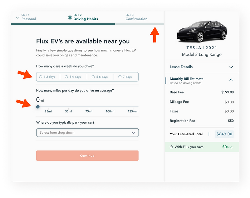
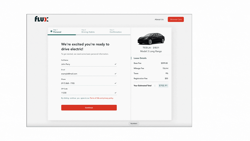
The first principle I applied was to break down the form process into digestible steps. This allowed me to limit the questions per page and group questions by similar topics.
I also used various visual form elements, such as sliders and horizontal field selectors, to make the process more engaging

One of the biggest challenges in this application design was how I would showcase fixed vs. estimated monthly costs.
Monthly costs are determined based on how many miles a driver drives. This information changes in real-time depending on how they answer the questions in the second step of the application process.
In order to not confuse the user and to clearly distinguish fixed vs. monthly costs, I staggered the different price breakdowns. The first step of the application process is a breakdown of the fixed costs under Lease Details.


When the applicant moves to the second step of the application process, the Lease Details collapse, and they are presented with a breakdown of their Estimated Monthly Bill.
As they start to answer questions, the taxes and mileage fees are calculated, dynamically giving the user their estimated total monthly costs as they progress in the workflow.
Having each price break down in an accordion allows the user to focus on the information presented without distractions.
I intentionally left the Lease Details breakdown in the second step so that users can refer back and even calculate it themselves if they have any questions about how their monthly bill was calculated.


Conclusion
Throughout this project, I never lost sight of Flux's mission of making electric vehicles accessible to all types of drivers. My goal was to simplify and relay over the right information that would resonate with EV-enthused users as well as allow users who are on the fence an opportunity to learn how it works. As a result, Flux saw a 50% increase in sign-ups after its initial launch.
